top of page

TMBR
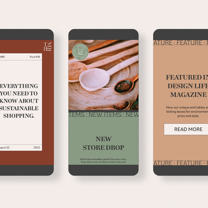
TMBR wanted to play with grids and grounded but bold colour choices, to give a professional but modern look. They opted for a simple logo, with minimal illustrations so that the imagery could really shine.
Custom stickers were also created as part of the brand, to soften the feel and break the grid system.
The end result is a strong but welcoming brand.

• MONTHLY RETAINERS AVAILABLE • LEARN MORE • YOUR CREATIVE PARTNER IN CRIME • GET IN TOUCH •
Faire Creative.
Faire means “to make”, “to do”, or “to play”.
Strategy-led branding, design and illustration.
bottom of page


